Problem: Many high school students are anxious about making the wrong choice for their future, and are concerned that their college/university applications won't be strong enough.
Target Audience: Highschool students trying to identify a career path.
STUC -Highschool Mentor Program Website
Pain points:
-
Not knowing what volunteer opportunities to pursue
-
Anxiety about strength of applications
-
Anxiety about choosing the wrong path
-
Feeling overwhelmed
Empathize:

This project was interesting because many of my students would come back and visit, and they would talk to me about how they did not know what they wanted to do. I interviewed a group of former students for my user research.
Students wanted the opportunity to:
-
Explore careers
-
Interview professionals
-
Job shadow
-
Be connected with
-
Volunteer/internship opportunities
Insights:

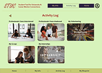
Insights informed the options - and IA was created to provide simplest format. In 'My Profile' students can select what they are looking for (interviews, internships, etc.). In 'Activity Log', they have a record of all their co-ops, volunteering, etc., which they can later use on their higher education applications.
My first paper wireframe homepage (top left image) had 2 columns of info to minimize scrolling. However it looked a little crowded so I tried other arrangements, and chose the design below. I also had a couple of iterations for the Activity Log.
Ideation:


Moderated user testing (on students) revealed that users found the design intuitive, but felt the spacing on the homepage needed to be reduced so they would instantly notice the heading ‘Useful Sites’.
Wireframes &
Usability Testing:
.jpg)
This is a selection of screens, starting with the screens students would use, and the last two are screens that the mentors would use. The fourth frame is clickable screenshots of other websites that would be helpful for the students to visit (e.g., the Ontario Colleges and Universities websites; the Ontario Trades website; and the Canada Higher Education website).
Mockups:


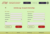

Users (teachers) felt that the Activity Log needed to be broken down into two types of activities per page, and that the color scheme needed to be more cheerful. Here are the final mockups.
Hi-Fi
Prototype & Usability Testing:

Tools: Adobe XD
Duration: 4 weeks
Role: End-to-end (researcher, writer, wireframes, mockups and prototype in Adobe XD, usability testing)
Next Steps:
-
Translation - based on regionally common languages
-
Add illustrations created by students
-
Outreach to potential mentors
-
Development and testing once site is populated with mentors